
3 Ways to Take Social From ‘Mobile First’ to ‘Mobile Only’
By: Carmen Collins, Cisco
March 13, 2018
I recently made an off-the-cuff remark at a conference that seems to have resonated in the Twitterverse: “If you’re using social media on a desktop…you work in social media.”
Depending on which study you reference, anywhere from 80-90% of social media time is spent on a mobile device. I’d argue that at 90%, you should start to plan content specifically for mobile. Here’s the good news: By adopting this strategy, it will also make it a better experience for that old-school 10% as well.
Thanks to the aforementioned mobile-device addiction, our attention span is about equal to…oh look, a squirrel!
On every platform, you’re looking to achieve “thumb-stopping moments.” You most likely hold your phone in your hand and use your thumb to scroll through the newsfeed of whatever social app you’re using. By simply positioning yourself as a user of social first (and a marketer using social second), you can begin to see how important this becomes.
Mobile-first social media is so 2017. It’s time to start thinking about social as mobile-only. Here are three things you should do to ensure you’re not alienating the vast majority of your audience.
Keep Text on Graphics to a Minimum (or Get Rid of It Entirely)
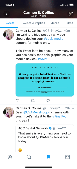 Let’s say you’re having an event. You want to tell everyone what day the event takes place, what time it starts, who is speaking, etc.
Too many brands cram all of this information onto a single graphic. It drives me bananas! Take the actual-size phone screenshot on the left—can you read that text?
If you’re on Twitter, folks, remember that Twitter just doubled your character count. If you can’t put the key information into 280 characters, you shouldn’t be using Twitter as a marketing tool. Twitter’s graphic size is 1024 x 512, which seems big, but on a mobile device, it’s tiny. If you must put text on your graphic, keep it short, sweet and make sure that the text is large.
If you’re on Instagram, remember that Instagram built its base by showing photographic moments, not text on graphics. Unless your business is providing inspiring quotes, your Instagram fans want to see an image. However, the same logic applies here—if you must put text on your graphic, keep it short, sweet and large. Use the text field (which gives you way more room for copy).
If you’re on LinkedIn, Pinterest, Facebook, WeChat and any other platform, this will also get you the biggest bang for your buck. Added bonus: by doing this you will be more inclusive of those who are visually impaired. The text descriptions are key for them to engage with your content.
Social Video is Short and Its Soundtrack is Silence
Some people will gladly watch a five-minute social video of funny cats, Jimmy Fallon, Carpool Karaoke or Mean Tweets—but those are entertainment. If you’re looking at marketing videos for consumer goods like donuts, Starbucks drinks or Apple products, you can probably get away with two to three minutes of social video. For the rest of us, 15 seconds of watch time is a good piece of content.
There is a reason that video on Snapchat started at 10 seconds and that the now-defunct Vine video was limited to six seconds. Look at your Facebook Insights for video. The metric they provide you is 10-second views. All of this information should tell you that your five-minute marketing video is about four minutes and 30 seconds too long.

Carmen Collins, Social Media Lead, Talent Brand, Cisco
It’s also important to remember that on mobile devices, video plays automatically but without sound, unless the user takes the action to turn the sound on. If all you have is talking heads but no subtitles, you might as well say goodbye to the effectiveness of that piece of content.
Front-load your video with key information, use it to tell a story and “hook” the viewer, and use captions on your video.
Embrace Vertical Storytelling
Video traditionalists and newsrooms hate vertical video because it doesn’t fill up the screen size of a television or a YouTube screen. As it’s here to stay, though, these content producers have found interesting ways to “hack” the format and make it work.
You should make it work, too. Whether or not you like Snapchat and Instagram, using the vertical storytelling format is key if you’re trying to reach anyone under the age of 30, because that’s how they’re consuming the content.
It makes sense, because that’s how we hold our phones naturally. Only if you’re my “Instagram Husband” (he has accepted his fate and learned to embrace it) are you conditioned to take a vertical photo, a horizontal photo and a square photo of the same thing. When given the choice, the easiest way to communicate is vertically.
Snapchatters hate when you insert a horizontal Snap. However, Instagram Stories has made it easier to turn horizontal images into vertical story slides. In that case, you would want to fill up the rest of the vertical space with stickers, text and other native platform fun.
Carmen Collins is the social media lead on Cisco’s Talent Brand team, and was recently named a 2017 Digital Communicator of the Year (while also winning the 2016 Social Media Professional of the Year) by PR News. Over her career, she has helped several Fortune 500 companies engage with their audience through great content and building relationships.
Follow Carmen: @CShirkeyCollins