We Need More Heart, Less Art On Social
By: Carmen Collins, Sr. Social Media and Talent Brand Manager, Cisco
September 10, 2018
I’m likely the most anti-marketing marketing person on the planet.
I completely understand the need that we social marketers feel to make something look beautiful, but I also err on the side of throwing beauty out of the window in favor of something that provides more “feels” and takes into account the way we connect with each other, especially on social media.
If you put a human being into an MRI machine, and show them things that trigger an emotional reaction, that MRI will show our brain lighting up like July 4 fireworks. Tell that same human in the MRI machine stats and figures, and they could be an extra on The Walking Dead.
I think the best example of this might be the “Instagram Grid” tactic. This is where you take one photo and divide it into six or nine individual photos that when puzzled together on your profile page make one, nice, beautiful image. It looks really, really good—even though I would argue that it also looks really, really bad—for your users, that is.
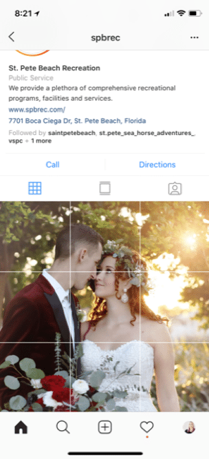
In order to make this happen, you have to post six or nine individual posts that will make up the one beautiful profile. More often than not, the individual posts will:
1) Look like spam, because you’re posting these six to nine posts all at once, which is not how people expect Instagram to work.
2) Won’t be terrific photos in and of themselves. That means that your engagement rate on these photos is going to plummet, and people are going to unfollow you.
3) You’ve just made your life harder, because now when you post, you have to post three posts together or else your beautiful profile photo will look broken, which also looks spammy.
Lastly, consider the total number of people who are visiting your actual profile page on Instagram. Just based on the few business accounts that I’ve had access to, 2-10% of your audience is going to see your actual profile page—90% of the time they are interacting with you on their newsfeed. Beautifying a profile so 10% sees a great marketing image while annoying 90% of your users doesn’t sound like a good tradeoff to me.
Here’s what users’ Instagram feeds look like when you offer them your shiny profile collage.
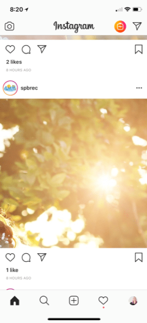
One like—that’s because as a stand-alone image, it’s a horrible one.
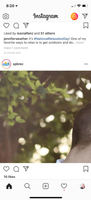
Oh look, someone’s neck. How did this get 10 likes?
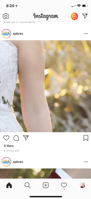
At least this one looks moderately artsy, but it’s not Instagram-worthy on its own.
See what I mean? The newsfeed is now cluttered with 9 not-great photos. While I love St. Pete Beach (I live nearby), I unfollowed the account.
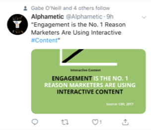
Another great example of “more heart, less art” is our need to create beautiful Twitter graphics with text on them like we would create a brochure or a banner ad. When we look at the image on our desktop on Twitter, it shines with award-winning potential.
Alas, there’s something we’ve forgotten.
The only people looking at Twitter on their desktop are social media marketers.
As of July 2018, 82% of Twitter users are viewing Tweets on their mobile device, and 90% of Twitter video views are coming from a mobile device.
Dear marketers, we are our own reason we can’t have nice things. No one is looking at that beautiful graphic on Twitter desktop.
Instead, they are thumb-scrolling right past it because they can’t read it, or, if it’s enough of a thumb-stopping moment to transcend the ability to read, they have to (gasp!) take an extra step and click on the Tweet to make it bigger.
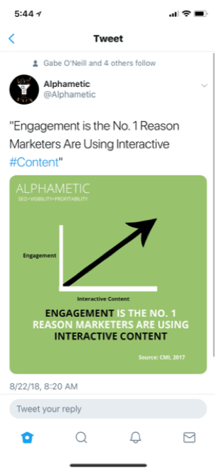
Another possibility is that we’re creating beautiful graphics without taking into consideration that Twitter graphics are horizontal. They display at a 2:1 ratio. If you post a square photo on Twitter, it still displays in the newsfeed as a horizontal image until you click on it to make it bigger.
When was the last time you clicked on a Tweet on your phone to make it bigger? Yeah, me neither.
Here are some examples. I took screenshots from my phone, true to size.

If you squint really hard, maybe, possibly you could read the text on that image. Wouldn’t it be more thumb-stopping if you made the image one of her and used the quote as the text? I’d read that!
The graphic and update use the same text (why waste the extra space?). And in this case while I can at least read the text, I have no idea—because it’s the wrong size for Twitter—what the graphic actually looks like this until I click on it. Which I’m not going to do while skimming through my feed unless I’m writing a post like this one.
Maybe in both of these situations, we can compromise as marketers.
A powerful, single image on the Instagram newsfeed will get you way more ROI than a grid on your profile. How many of your current users are going to your profile unless you’re telling them to? There’s a reason that the most-followed account on Instagram (after Instagram’s own account, of course) is National Geographic. I dare you to find one photo that they post that doesn’t somehow move you, and I can assure you that they have never had a photo grid on their profile.
A powerful, single image on your Twitter newsfeed will create those thumb-stopping moments. And all that text you’re cramming onto the image? For Pete’s (or @Jack’s) sake, they just doubled your character count. Put the text in the update and let the image draw them in.
If we put a little more heart, and a little less art into our marketing, just imagine the possibilities around connecting with our audiences.
Follow Carmen: @CShirkeyCollins